Brochure Printing Demystified: Choosing the Right Size and Design for Your Needs
- Himanshu Bajaj
- Nov 20, 2024
- 2 min read
One excellent way to display your company and goods is with a full-color brochure.
Typically, brochures come in three common sizes: 8 ½ x 11(A4), 8 ½ by 5.5, and 11 x 17. Each of the many brochure sizes has a distinct use.
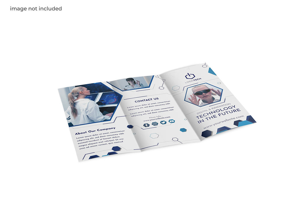
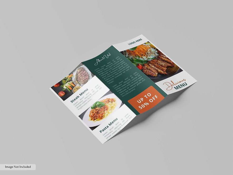
For instance, the 8 ½ x 11 unfolded brochure is frequently used to create product sheets and may be tri-folded if it ever has to be utilized as a business brochure.
However, the 11 x 17 brochure might be used by businesses looking to cut costs. Just fold these 11 x 17 brochures in half.

When making brochures, there are a few factors to take into account. Making the cover as captivating as you can is the first step. Brochure Printing Must Be done carefully and with due diligence.
Keep in mind that when your customers receive your brochures, they will probably notice the cover first.
Customers' initial perceptions of your company will be influenced by the cover.
Similarly, strive to develop a topic that your target audience can identify with and then utilize throughout the brochure's content.
For a far bigger impact, utilize a single, large graphic to tell a tale that is meaningful to your viewers.
Again, when selecting images for your brochures, it's important to pick ones that give a sense of the message you wish to get over.
After that, add subtitles to the cover to provide your viewers even more details about what's coming next. Your brochure should contain as much information as possible.
Don't be scared to offer all the pertinent information you think your clients would find useful.
Next, underline all the information you want your clients to remember about your company, such as your business's phone numbers, address, and hours of operation, as well as the prices of your goods and services.
Then, since pictures imply reality and are shown to improve recall by 26%, use them rather than drawings.
Finally, attempt to make your brochures valuable. Use persuasive language to persuade customers to keep supporting your company. Get only the best brochure printers to produce your brochures.

Creating an Eye-Catching Brochure Design
One marketing tool that targets potential clients directly is a brochure.
There is more to designing a successful brochure than merely picking the colors and typefaces.
It all comes
down to producing a unified, eye-catching artwork that embodies your brand and draws in your target market.
Consider the following design elements:
1. Eye-catching Cover Art Customers' first impression of your company is greatly influenced by the cover of your brochure, which they will view initially. The cover designed should be professional, eye-catching, and pertinent to your message. Make an effort to produce a striking, distinctive layout that entices readers to continue reading This is the first and foremost the most important step while Initiating Brochure Printing
2. The Influence of Themes
A unified story that appeals to your audience is produced by a recurring theme in your brochure. Your brochure's color scheme or overarching design concept should tell a cohesive tale.
Make use of images or pictures that support your point and are closely related to the material. Sometimes a single, powerful image can have a greater impact than a number of lesser ones.
3. Utilizing Pictures Photographs of a high caliber can have an impact. Your brochure will seem more genuine and realistic if it includes pictures of your goods, services, or workplace. Photographs are a great way to improve the effectiveness of your brochure because they have been shown to increase retention by 26%.
4. Provide Useful Information The content of a brochure should be brief but educational. Make sure to emphasize crucial details like contact details, product prices, business hours, and service information. Add captions beneath photos to give readers more background information and entice them to interact with the material.

Comments